Rideshare System Redesign
Redesigning driver feedback to reduce bias and increase completion rates
Role
UX Research, Interaction Design, Prototyping
Course
INFO-I300 Human-Centered Design
Duration
6 weeks · Spring 2026
Team + Deliverable
Derron Kosim, Angelo Gonzalez · Functional prototype + pitch video
The useful version, before the long version.
Rideshare Redesign: A six-week, two-person system redesign focused on making post-ride feedback faster, more contextual, and more useful to both riders and drivers.
- Challenge
- Star scores lacked context, amplified bias, and gave riders little reason to complete the rating flow.
- My role
- UX research, interaction design, and prototyping, culminating in a functional demo and pitch video.
- Evidence
- We tested with six people—four regular passengers and two active drivers—using the end-to-end prototype.
- Observed result
- Every participant completed the flow in under a minute; drivers preferred specific tags over unexplained star scores.
Scope note: These are usability findings from a student prototype, not production completion-rate or bias-reduction metrics.
The Problem
Uber's 5-star rating system has three core problems. It's biased: star ratings without context amplify racial and gender bias because a 3-star tells a driver nothing about what actually went wrong. Most users skip rating entirely because there's no incentive and the process feels pointless. And the system is one-sided. Drivers bear the consequences while passengers face no equivalent accountability.
“How do you design a rating system that's fast, fair, contextual, and actually gets used?”
The question we set out to answer: how do you design a rating system that's fast, fair, contextual, and actually gets used?
Research
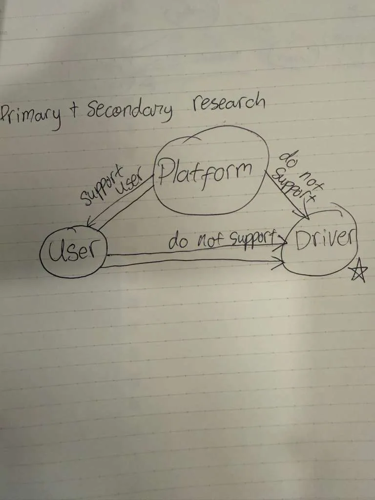
We mapped the three stakeholder relationships in the system: the platform supports users, the platform does not support drivers, and users have no direct accountability to drivers. The driver is the most vulnerable node.
Secondary Research Findings
- Star ratings without context are meaningless and amplify bias.
- Incentives significantly increase review completion rates.
- Emoji-based scales reduce cognitive load and process faster than numerical scales.
- Time pressure after a ride causes users to skip rating entirely.
- Smiley face scales improve visual processing of satisfaction questions.
“The system fails drivers not because users are malicious, but because users have no good reason to participate.”
Key insight: the system fails drivers not because users are malicious, but because users have no good reason to participate and no good tools to be specific.
Design Decisions
Three problems, three solutions.
Clarity Over Stars
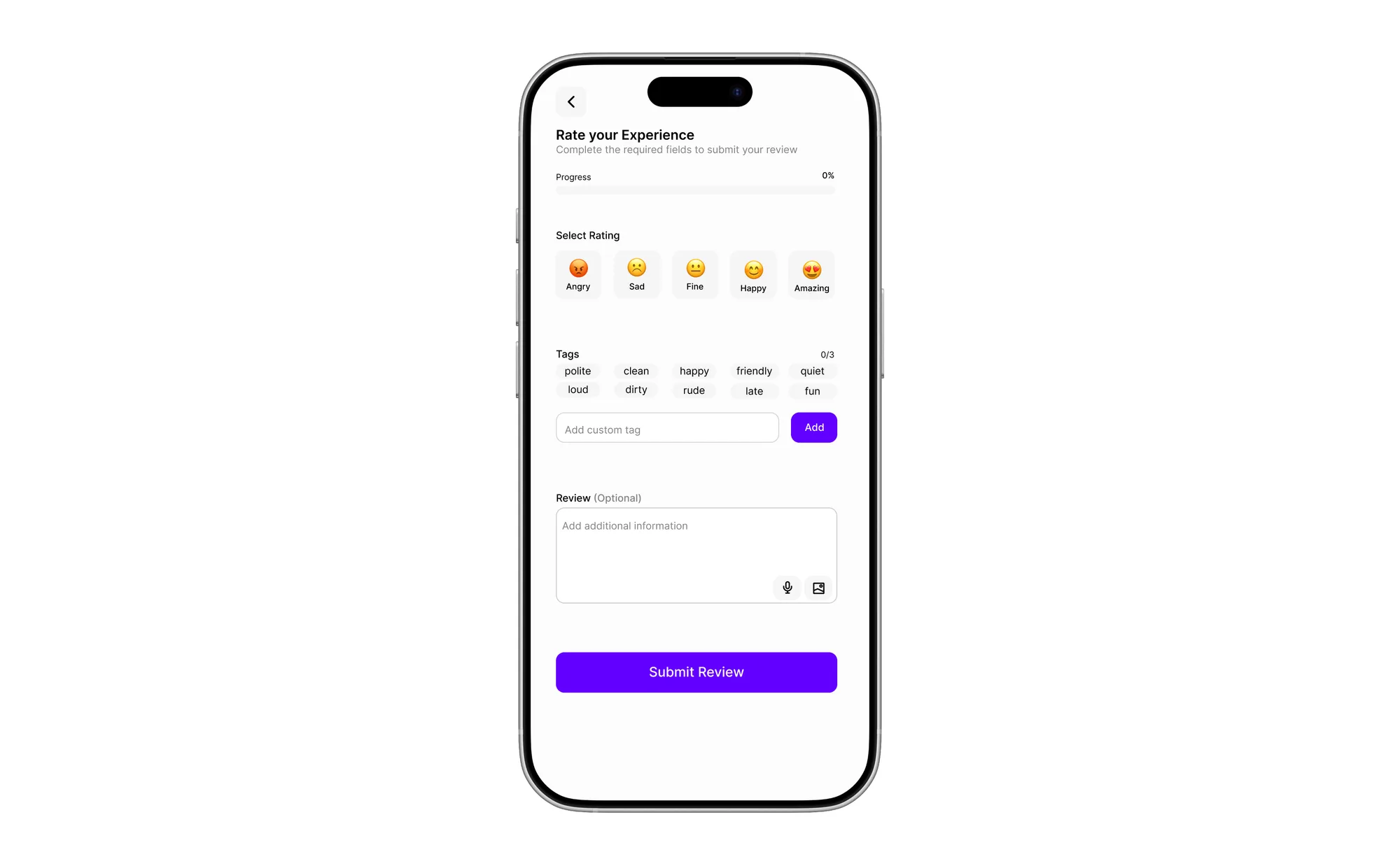
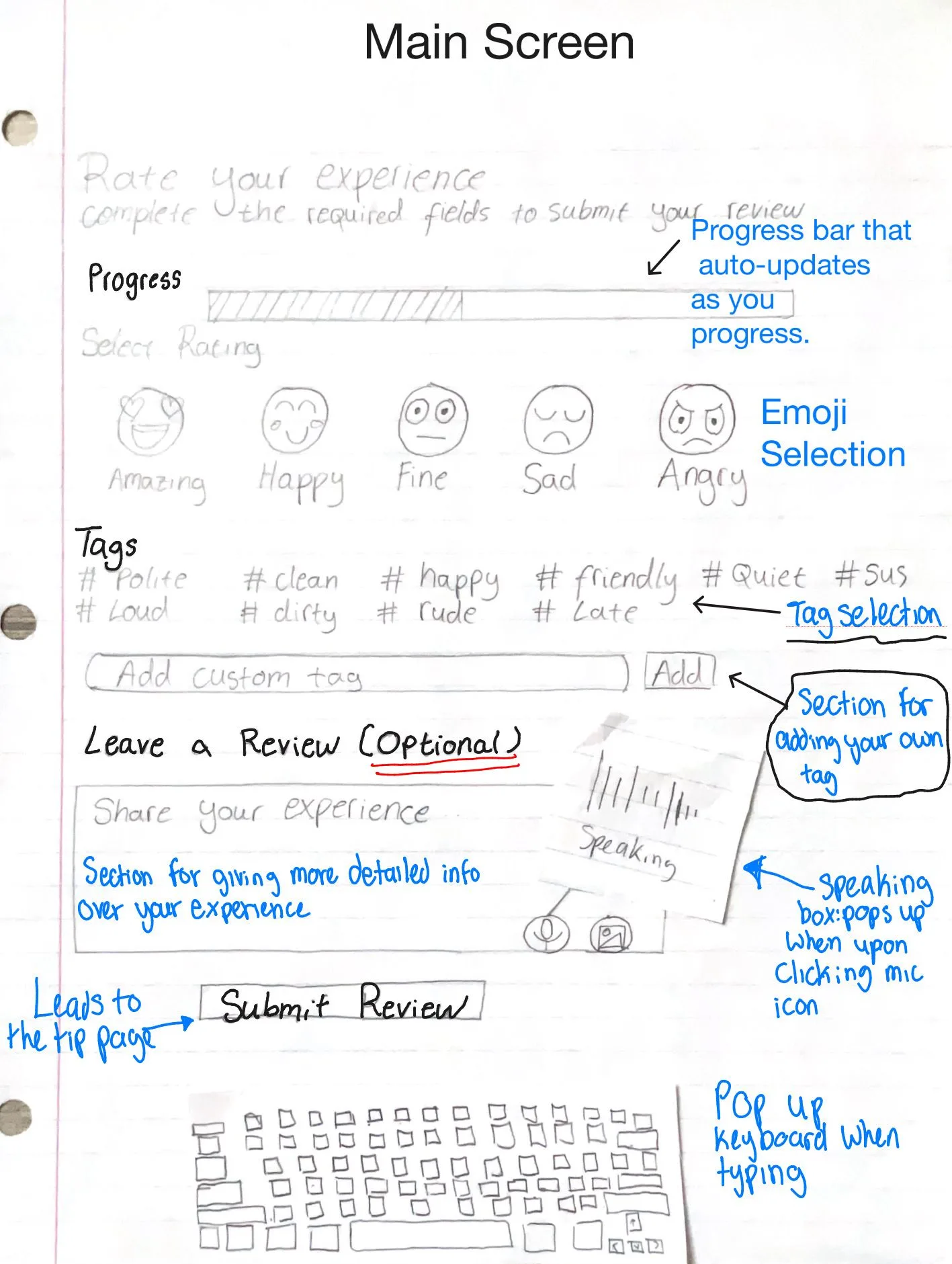
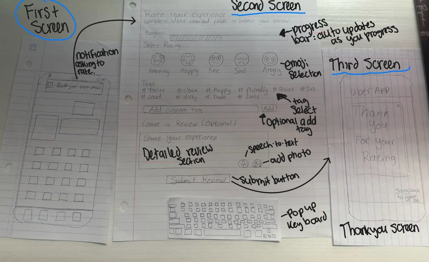
Replaced the 5-star scale with 5 emoji ratings: Amazing, Happy, Fine, Sad, Angry. Emojis communicate sentiment instantly without the ambiguity of whether a 3 means okay or bad.
Tags for Context
Users select 3 required tags from a preset list: #polite, #clean, #happy, #friendly, #quiet, #sus, #loud, #dirty, #rude, #late. Tags give drivers actionable feedback and anchor ratings to specific behaviors rather than gut feeling.
Incentives to Rate
Users who rate receive a discount on their next ride. Drivers who receive ratings earn a bigger cut on their next trip. Both sides now have a reason to participate.
Optional Depth
Text review, voice recording, and photo upload are all optional. Required fields are emoji plus 3 tags only. Minimum 3 clicks to complete a rating.
Rate During the Ride
Users can rate while still in the car, with a 10-minute window after the ride ends. Removes post-ride awkwardness and time pressure.
Passenger Accountability
Drivers can rate passengers using the same system, addressing the one-sided power dynamic.
Prototype
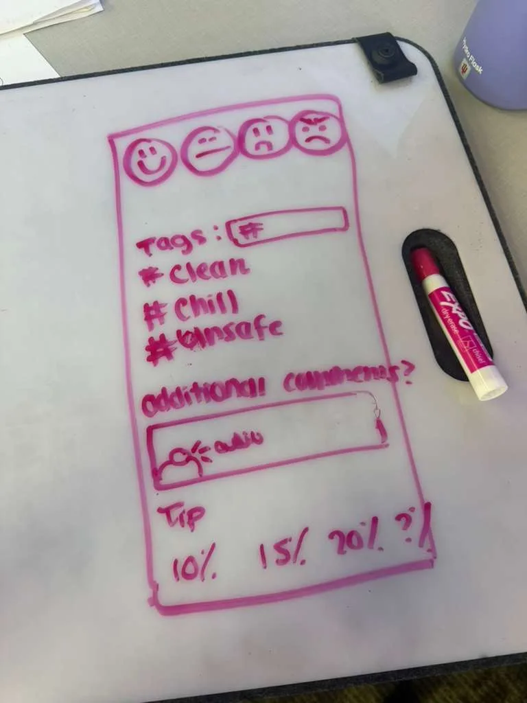
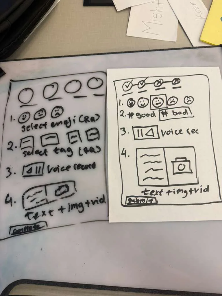
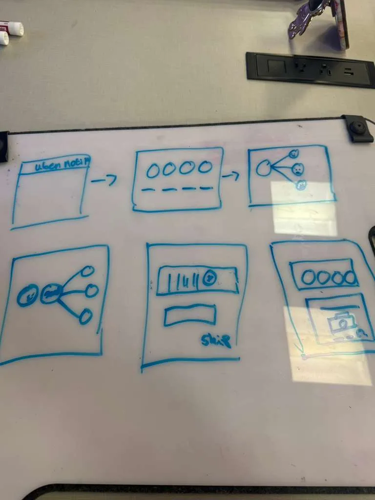
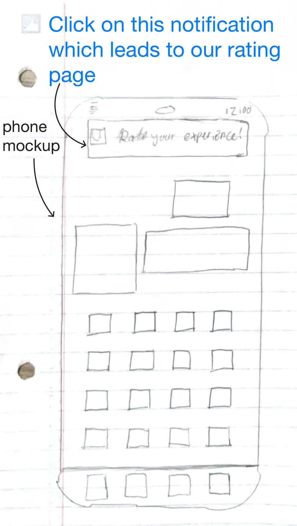
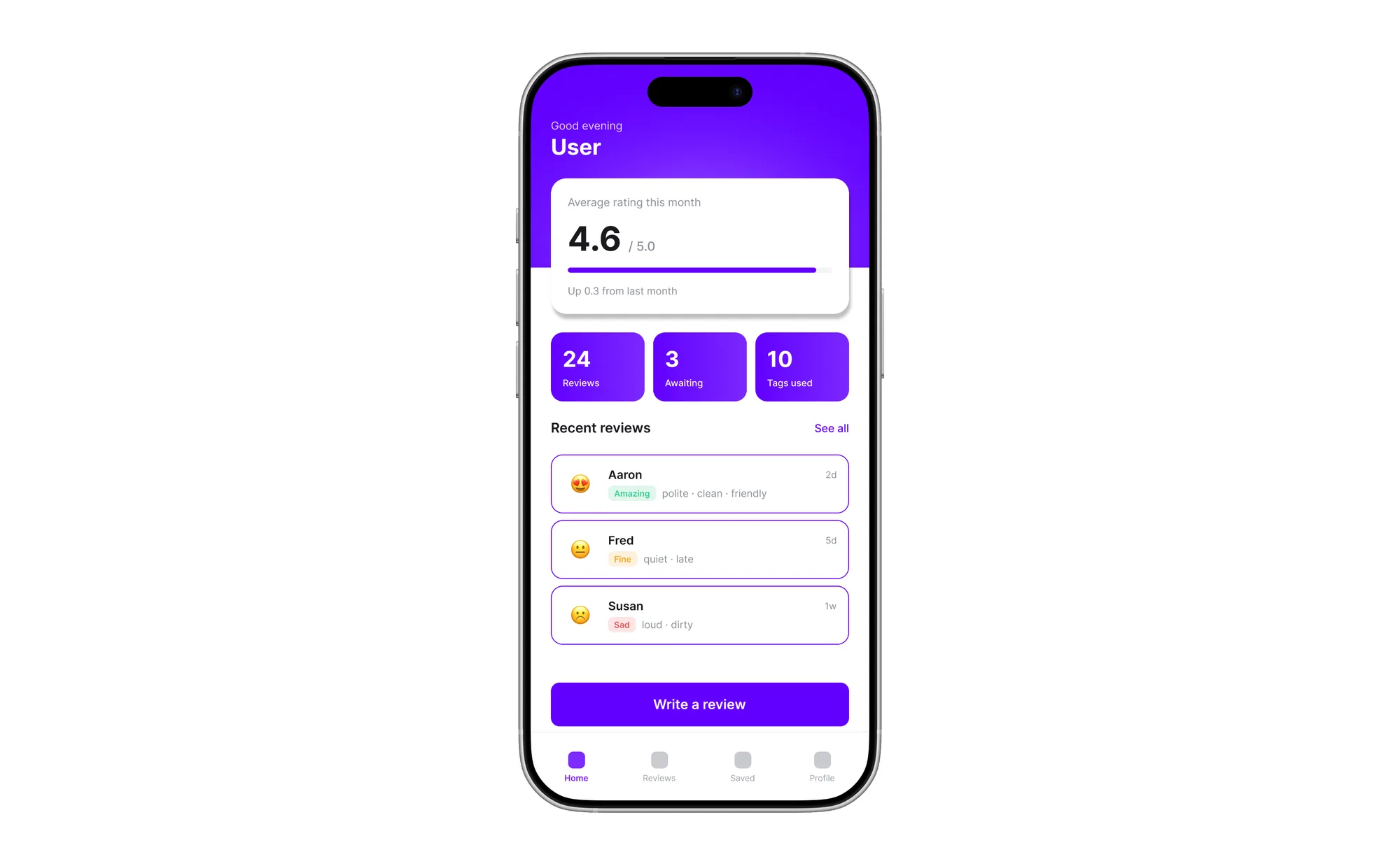
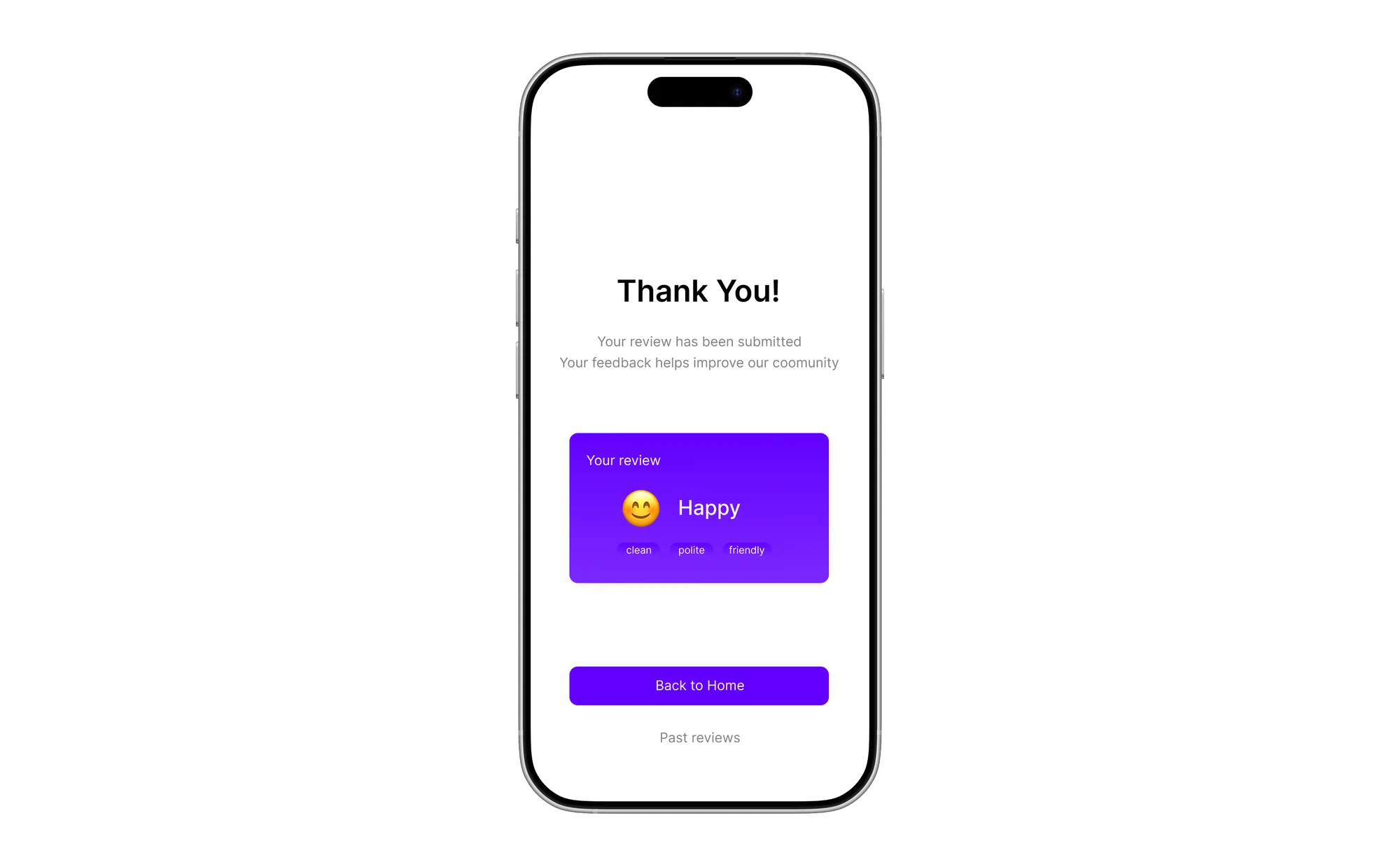
Before building anything digital, we mapped the full rating flow on paper: entry from a push notification, emoji selection, tag picking, optional fields, and a thank you confirmation. Paper let us stress-test the sequence quickly and identify which steps caused hesitation before committing to screens.
The wireframes captured the full flow end-to-end and were used in usability walkthroughs with participants before any functional prototype was built.
User Testing
Usability testing and walkthroughs with 6 participants: 4 regular Uber passengers and 2 active drivers. Task for passengers: rate an experience for your Uber driver. Drivers reviewed the feedback they would receive under the new system.
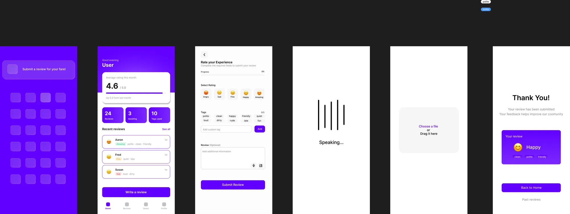
All participants completed the flow successfully. The notification entry point, emoji selection, and tag system were understood without instruction. The required vs optional distinction was immediately clear. The full flow completed in under a minute. Drivers responded positively to receiving specific tag-based feedback over raw star scores.
Final Design
A rating experience that takes 3 clicks minimum, gives drivers specific actionable feedback through tags, rewards both riders and drivers for participating, allows rating during or after the ride, and holds passengers accountable through a mirrored system.
The final prototype was built as a functional demo using Figma Make. The progress bar updates in real time as required fields are completed, giving users a clear sense of how close they are to done without any added pressure.
Pitch Video
Reflection
The core design tension was between depth and speed. More detail means better feedback for drivers but higher friction for users. The solution was making depth optional: emoji and 3 tags is the floor, everything else is voluntary. The incentive system addresses the completion problem without adding mandatory work.