FridgeMate
Redesigning shared fridge organization for college households
Role
UX Research, Product Design, Prototyping
Course
INFO-I300 Human-Centered Design
Duration
6 weeks · Spring 2026
Team
Rohan Goenka, Anushka Dave, Angelo Gonzalez, Amoolya Bysani
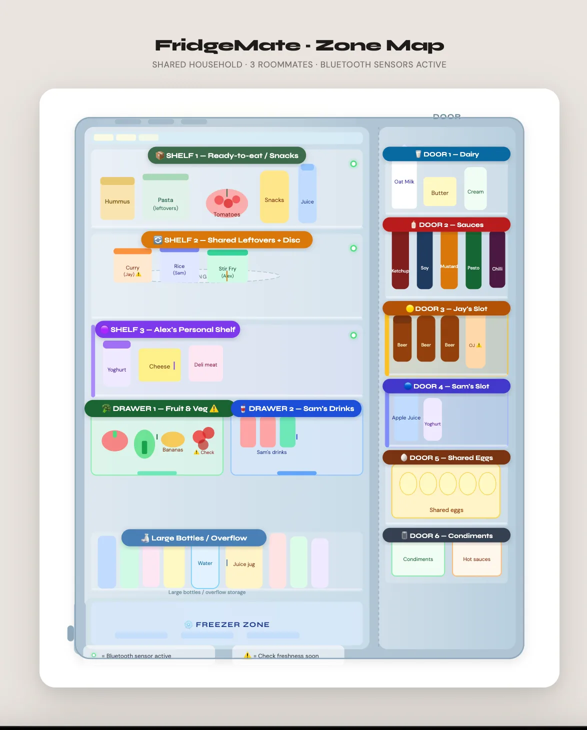
The useful version, before the long version.
FridgeMate: A six-week team project exploring how a modular physical fridge and a restrained digital companion could make shared food more visible and easier to coordinate.
- Challenge
- Shared-fridge waste came from hidden food, rigid storage, and unclear ownership—not a simple lack of capacity.
- My role
- UX research, product design, and prototyping within a four-person student team.
- Evidence
- We tested the physical prototype and app wireframes with four college students using open-ended tasks and think-aloud feedback.
- What changed
- Testing led us to add one dashboard for at-a-glance status and move zone editing directly onto the fridge map.
Scope note: This was a low-fidelity concept study. Durability, Bluetooth reliability, manufacturability, and longitudinal waste reduction remain untested.
Overview
Food waste in shared apartments isn't caused by lack of space. It's caused by poor visibility, inflexible layouts, and forgotten food. FridgeMate is a hybrid system combining a modular physical fridge design with a lightweight companion app, built for college students living with roommates who have irregular shopping habits, busy schedules, and low tolerance for complex technology.
The Problem
College students living in shared apartments face a consistent set of fridge problems: leftovers pushed to the back and forgotten, large items disrupting shelf balance, drawers that hide food instead of highlighting it, and no clear system for shared ownership. The fridge technically has enough space. The problem is how that space is designed.
“This isn't a storage problem. It's an organization, visibility, and flexibility problem.”
We reframed the question: this isn't a storage problem. It's an organization, visibility, and flexibility problem.
Research
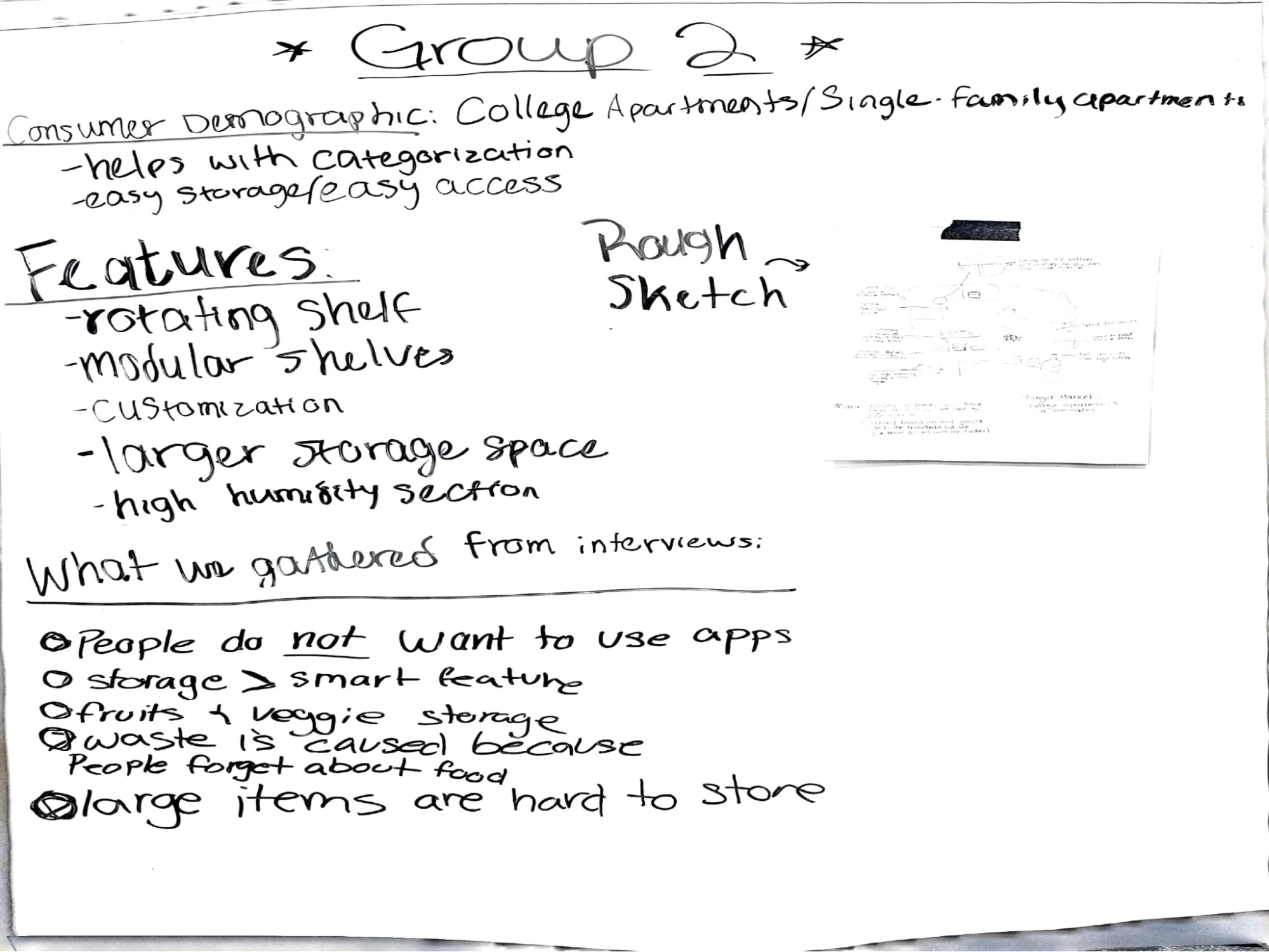
We conducted structured interviews with four college students living in shared apartments of two to four people. Questions covered what they store, what frustrates them most about shared fridge use, how they handle spatial conflicts, and whether they'd use smart or mechanical features to improve organization.
Key Findings
- The core problem was not conflict between roommates. It was lack of intuitive organization.
- Fresh produce and leftovers were frequently forgotten when pushed to the back or stored in drawers.
- Large items consistently disrupted shelf balance and created overflow problems.
- Main shelves worked well because they kept food visible and surfaced what needed to be eaten first.
- All four participants preferred physical and mechanical improvements over smart features.
- Fixed compartments and rigid labels felt limiting; participants wanted the ability to reconfigure weekly.
“Food that is visible gets eaten. Food that is hidden gets wasted.”
While interviews showed a strong preference for mechanical solutions, the project required us to define what “smart” means in this context. We explored a minimal digital companion that reinforces, rather than replaces, physical organization, using technology only where human memory and coordination routinely fail.
Design Decisions
Three principles guided every decision: reconfigurable storage over simply adding more space; visibility as the primary design driver; modular components including adjustable dividers and movable sections as the foundation.
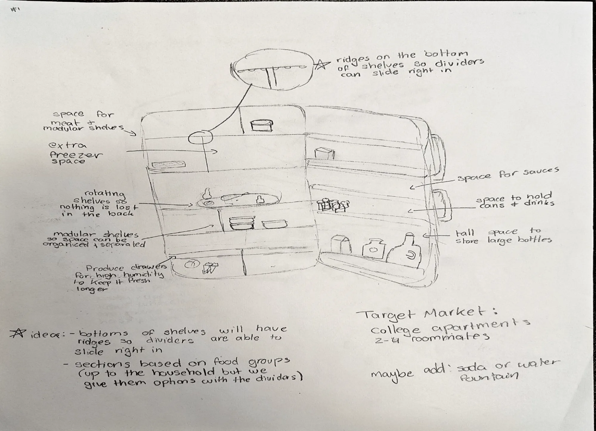
Physical Fridge
- Adjustable modular shelves with optional dividers
- Rotating lazy susan to bring back-of-fridge items forward
- Dedicated produce drawer with humidity controls
- Extended door storage for large containers
Companion App
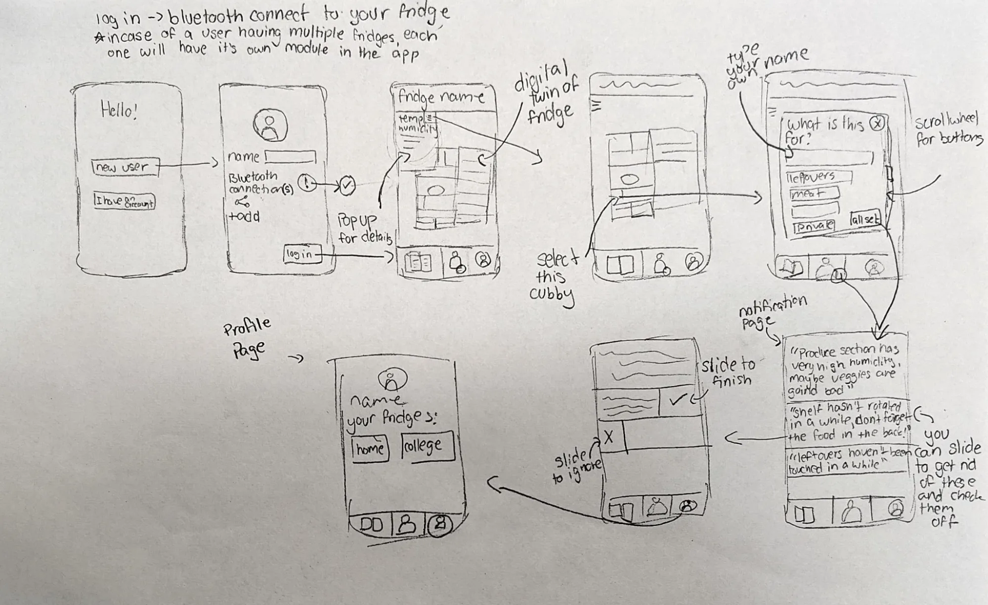
The app doesn't replace physical organization; it reinforces it. A digital twin mirrors the fridge layout. Sensors monitor zone temperature and humidity. Users can label zones, assign ownership to sections, and receive gentle nudges when produce is nearing expiration or a shelf hasn't been rotated recently.
Prototype
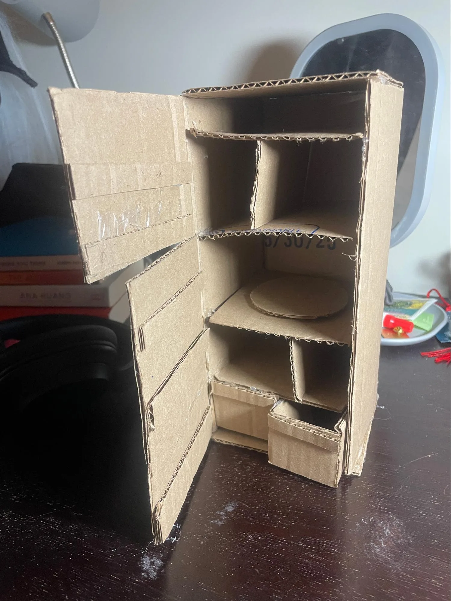
We built a physical cardboard prototype to scale, complete with functional rotating lazy susan, removable dividers, dedicated produce drawer, and clear freezer separation. Building physical let us test the interaction model before writing a single line of app code.
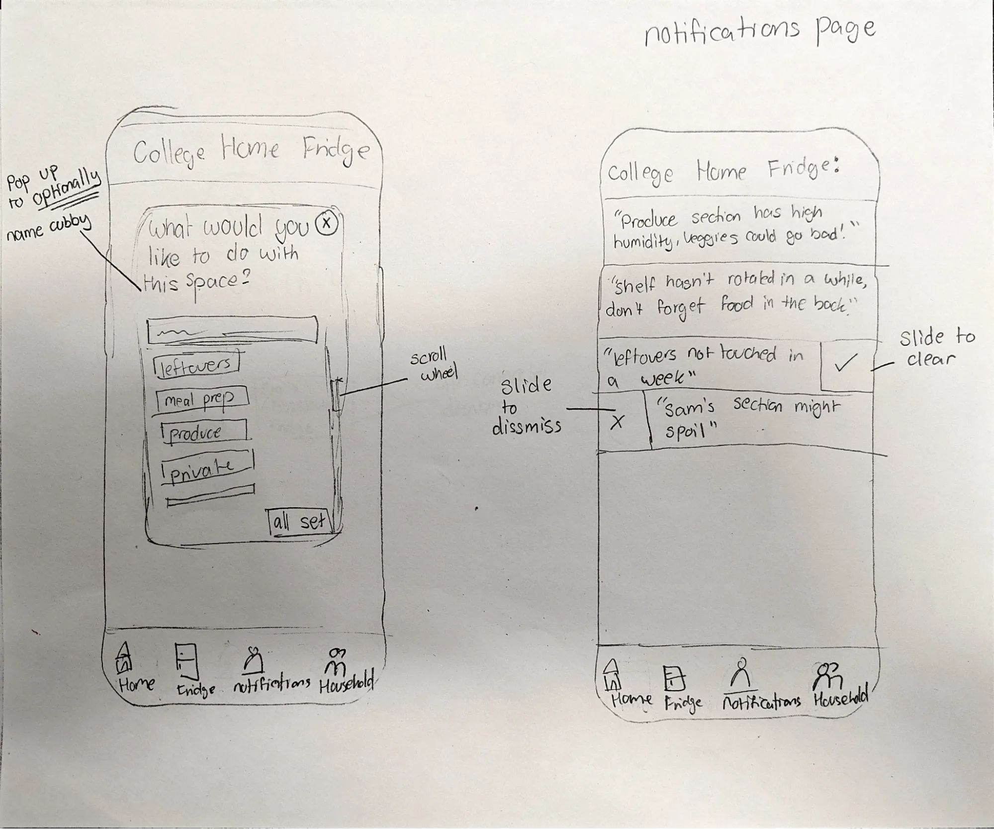
App wireframes mapped the full flow: onboarding and Bluetooth pairing, the digital twin fridge map, zone labeling, notification settings, and the main dashboard.
User Testing
We tested with four college students using both the physical prototype and app wireframes simultaneously. Participants were given open-ended tasks and encouraged to think aloud as they interacted with both the physical and digital components.
What We Observed
Participants engaged with the rotating lazy susan immediately, identifying personal use cases like dedicated zones for meal prep, eggs, or frequently accessed condiments. Removable dividers felt intuitive without instruction. Zone labeling caused brief initial confusion but resolved quickly with minimal guidance. Across the board, participants wanted notification control: nudges only when something genuinely needed attention, not as a constant presence. The biggest consistent request was a single dashboard view: all key information visible at a glance without navigating between screens.
Changes After Testing
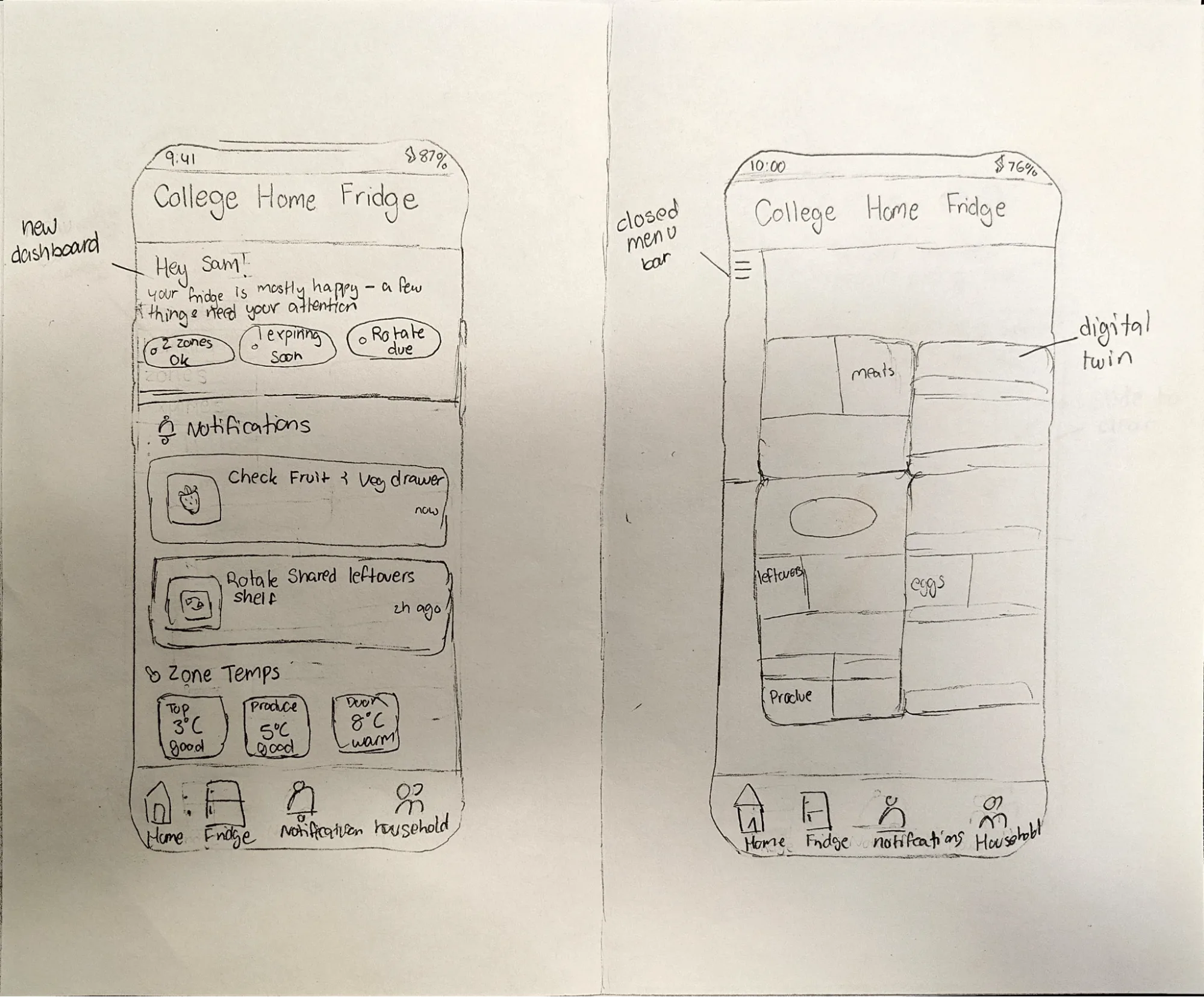
- Added a main dashboard home screen showing zone temperatures, active nudges, and sections without recent movement all in one view.
- Made zone editing accessible directly from the fridge map rather than buried in settings.
Final Design
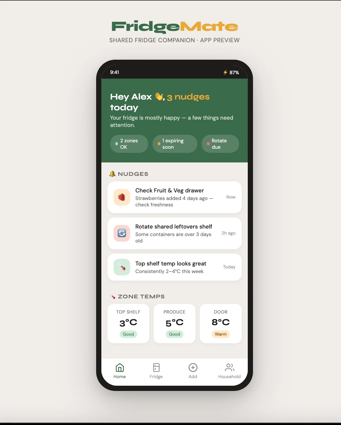
The main dashboard greets the user by name and shows a quick status summary: zones OK, items expiring soon, rotations due. Active nudges with timestamps and zone temperature readings at a glance.
The digital twin shows the full fridge layout with named zones, ownership labels, and live sensor status. Tapping any zone reveals its details, settings, and history.
Reflection
FridgeMate showed that meaningful reductions in food waste come less from adding capacity and more from redesigning visibility and shared coordination. The modular physical structure does most of the work. The app fills in only where human memory and coordination routinely fail.
Limitations
Our research focused on a small group of college students so findings may not generalize to other demographics. The prototype is low-fidelity cardboard. Durability, manufacturability, and actual Bluetooth reliability through fridge walls remain untested. We haven't conducted longitudinal studies to measure actual waste reduction over time.
← Back to Work