Meta · Concept · Fall 2026
Beyond the Group Chat
Plans die in group chats because a request aimed at everyone is aimed at no one. This is a Messenger concept that asks a few people privately first, so the plan reaches the group with an answer already attached to it.
Interviews and a diary study
How young adults really plan, including a walkthrough of one plan that worked and one that died.
Competitive teardown
Partiful and Apple Invite taken apart, with a cause of death written for each.
Prototype and usability testing
A Messenger prototype in Figma, tested with people outside the team.
Problem
A request aimed at everyone is aimed at no one.
Meta asked us to look at where plans go to die. Young adults coordinate almost everything in group chats and most of it never happens: the plan gets floated, the conversation moves on, and the idea scrolls away without ever being refused. Nobody said no. Nobody said yes either. The stakes are not just a missed dinner — people aged 15 to 24 now spend about a quarter of the time with friends in person that they did in 2003 (Kannan & Veazie, 2023).
This is not a logistics problem. It is a social one, and it is about who is being asked.
That distinction is the whole project. Treated as logistics, the fix is a better calendar or a louder reminder. Treated as a social problem, the fix is changing what it costs to answer.
Solution
Events: a step inside Messenger that asks a few people before the group.
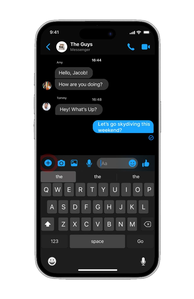
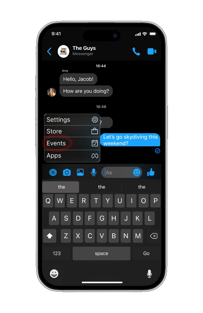
The goal was to make a real answer cheaper to give than silence. Events sits in the + menu beside the camera and the gallery, and changes one thing about how an invitation travels: instead of landing in front of everyone at once, it goes to a handful of people individually, and only reaches the group once some of them have said yes. Each rule below came out of one of our three findings.
Individual vs group
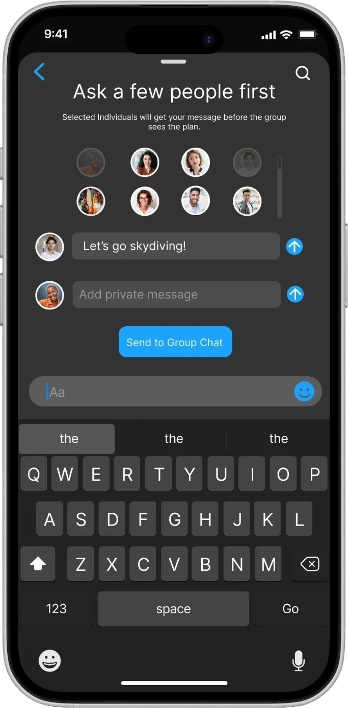
Invite individuals before the group
Asking eight people at once is what makes ignoring free.
Lack of clarity
Declines stay private by default
Making them public is a checkbox you have to find and turn on.
Value of leadership
One owner, one short form
Every plan that worked had one person carrying it, so the job was to make that job smaller.
The trade-off we made
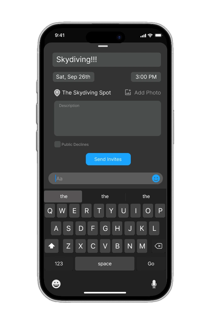
A private decline gives the initiator something the group does not have. That is an asymmetry, one step from feeling like surveillance. We took it anyway, because the alternative is the silence we set out to fix. What we would not do is hide it: the event form carries a Public Declines checkbox, off by default, so making declines visible is a decision the initiator takes rather than a behaviour the feature assumes.
A no that costs nothing is worth more than a no that never gets said.
Journey
Three findings, and one piece of old research that explained all of them.
Each of us sketched against the brief alone before we compared concepts and used the McCarthy Decider and Resolution protocols to settle on one direction rather than averaging four. Interview notes went onto an affinity diagram before anything was drawn in Figma.
The autopsy
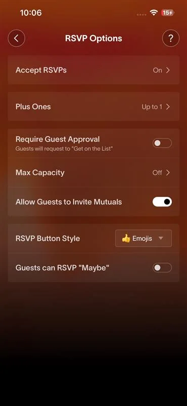
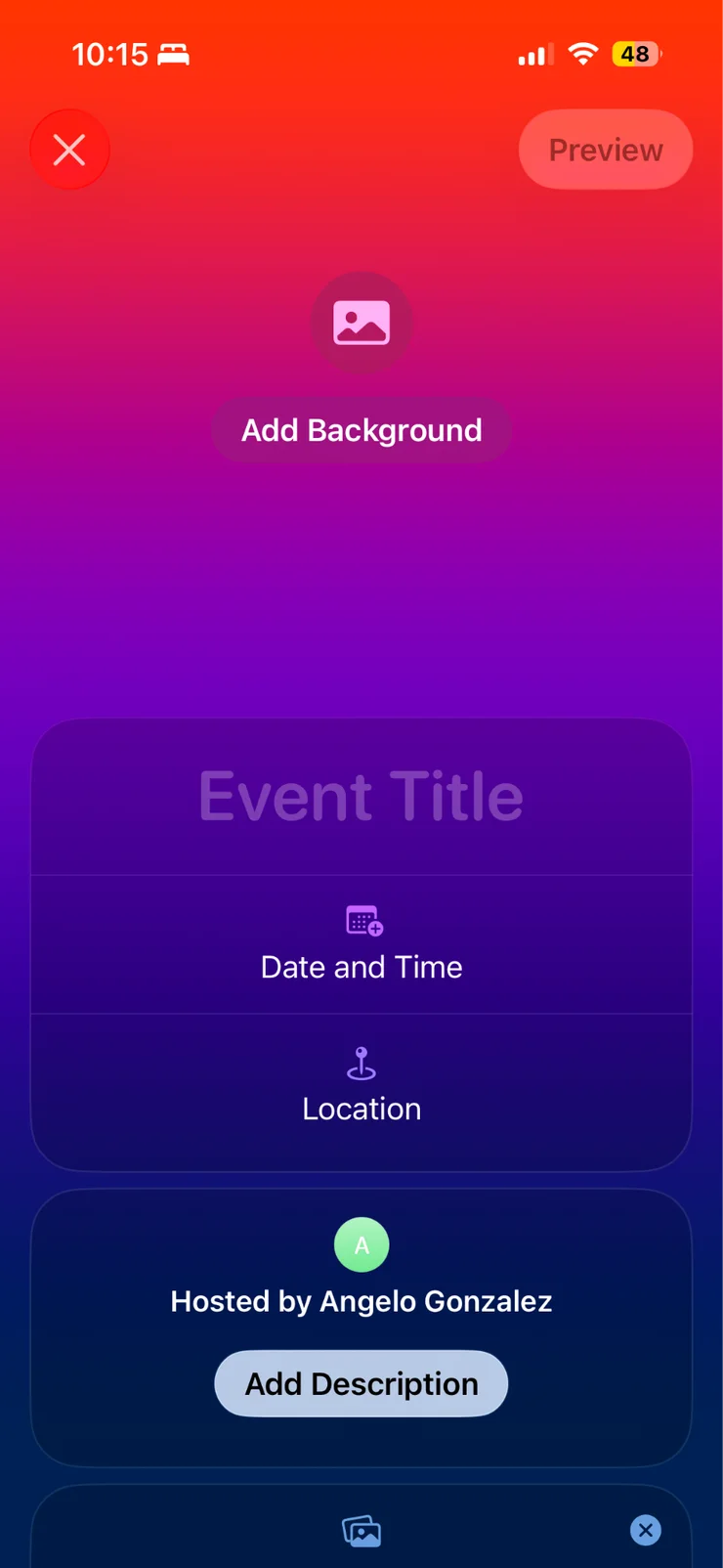
We took apart the two tools closest to this problem. Both had real strengths — heavy personalisation and guest controls on one, calendar sync and shared albums on the other — and both still made deciding harder in order to make organising easier.
What we heard
Lack of clarity. When people are not comfortable saying a clear no, silence leaves the initiator with nothing to act on. Some interviewees declined plainly; others made an excuse, let the message sit, or went along with a plan they did not want. Several said they would only follow up once or twice, because more starts to feel needy.
Individual versus group. Asking one at a time produced a much higher response rate and more yeses, because the social cost of ignoring a direct question is higher.
“When I reach out to a few people individually before sending it to the group chat, I've never had an issue with organizing an event.” Interview participant
The value of leadership. Every plan that worked had someone who started it, gathered availability, proposed a time and place, and followed up. One described a plan succeeding precisely because they were “planning and coordinating everything.” Without that person, nothing moves.
Why it happens
The mechanism is the bystander effect. Markey (2000) found that across 400 online help chats, the larger the group the slower the help, while naming one person produced a high response rate. Barron and Yechiam (2002) found the same by email: a request sent to one person got more responses than the identical request sent to five.
When everyone is asked, everyone assumes someone else will answer.
In a group chat responsibility is shared, silence has cover, and ignoring a message costs nothing. In a direct message responsibility is yours and silence is noticed. So the fix is to change who is being asked, not how loudly.
User Journey
One person asks a few people quietly, then the group gets a plan.
1 · Create it where people already attach things
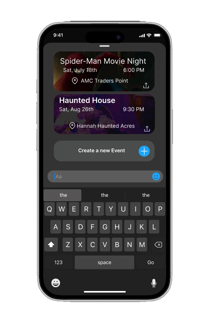
Events sit in the + menu, beside the camera and the gallery. Opening it shows past events and a Create a new Event button; the form itself asks only for what a participant needs to see.
2 · Ask a few people first, one to one
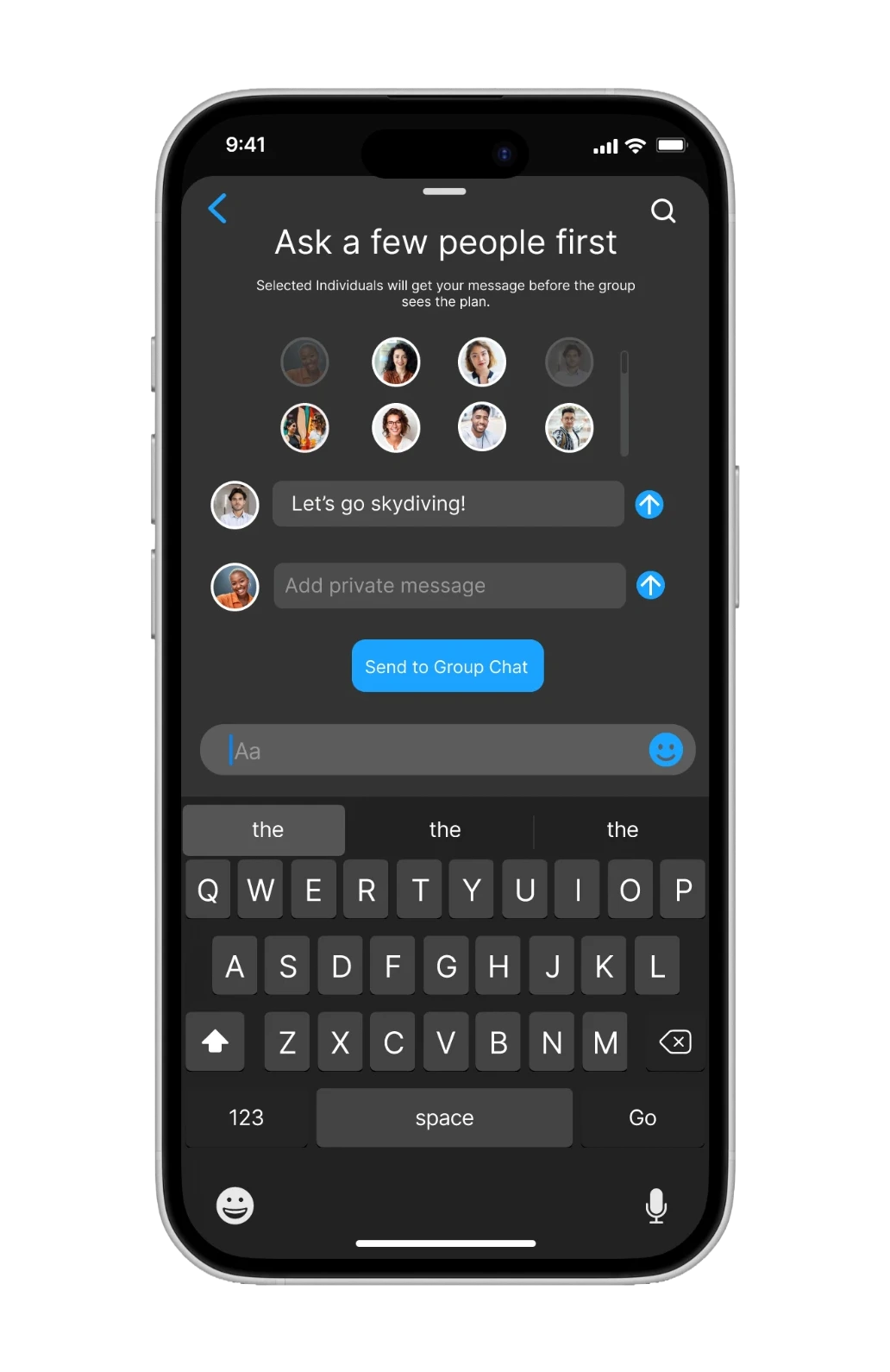
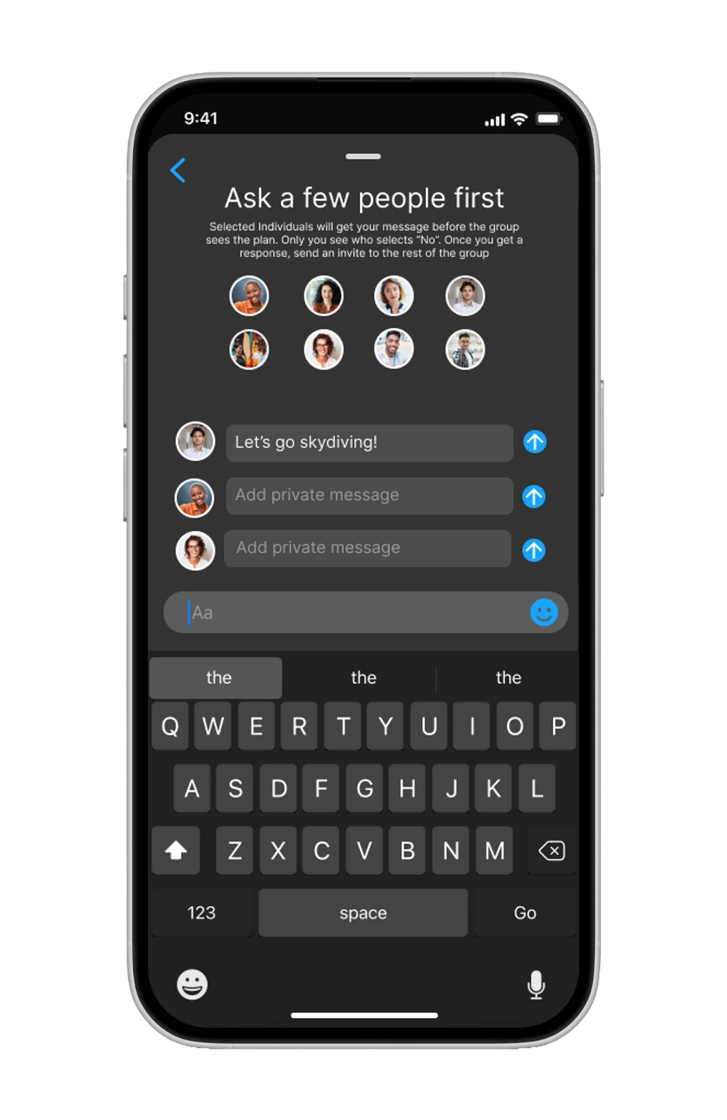
This is the screen the whole design turns on. You pick a few people to send a personalised invite to before the group sees anything, each with room for a private note. Sending straight to the group is still there, just not the default.
3 · Answer in one tap
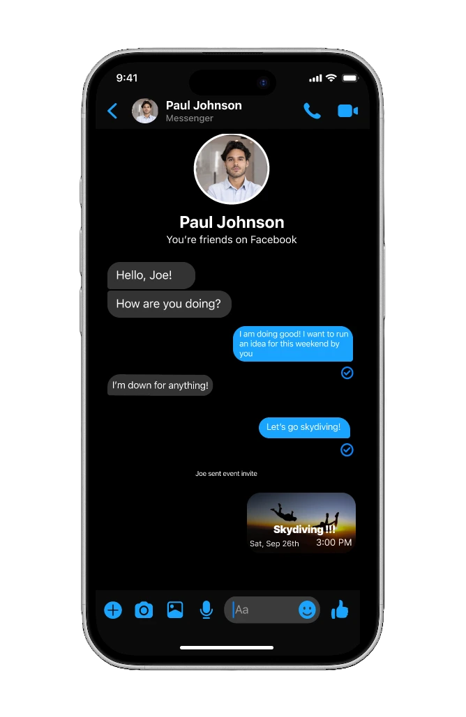
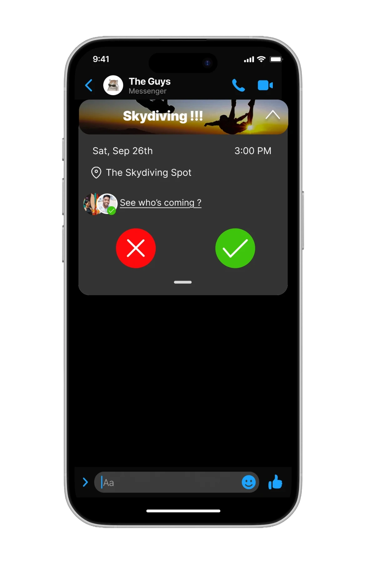
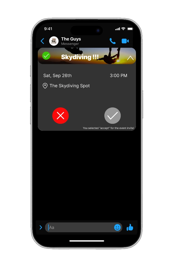
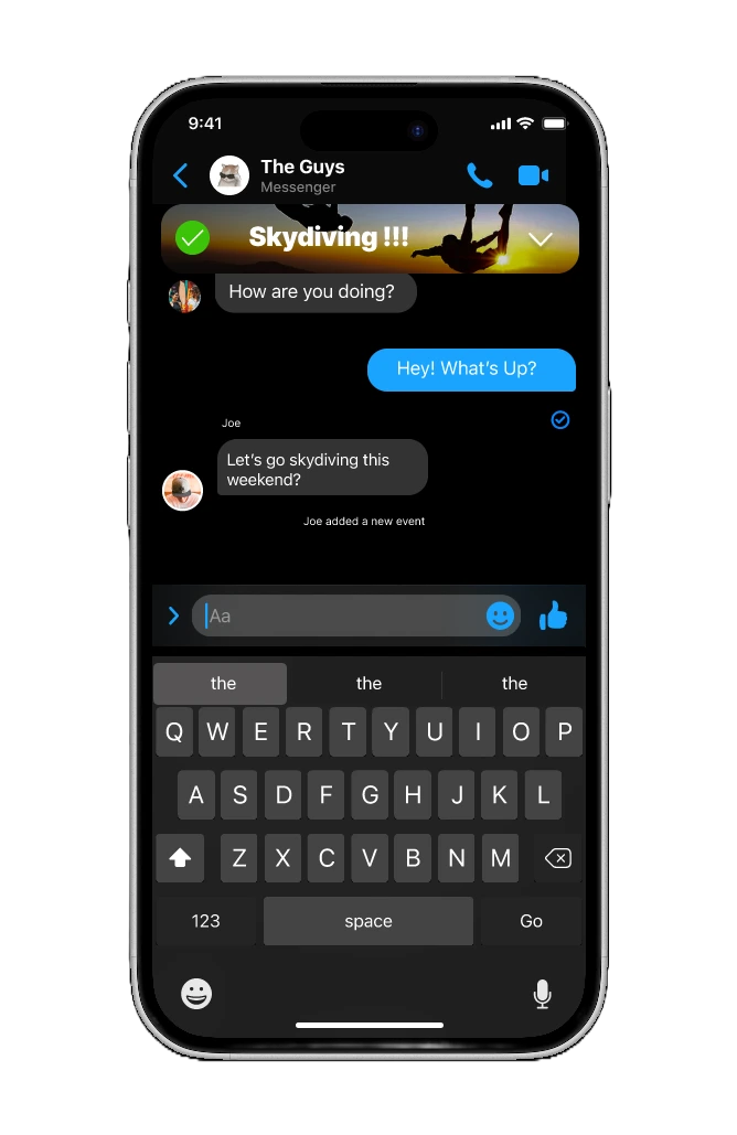
Once it reaches the group, a banner pins to the top of the thread with a small notice in the conversation. Tapping it opens a dropdown: yes, no, or see who is already coming. After you answer, your choice greys out and a green check appears on the banner, so the question stops being asked. Collapse it and the plan stays pinned above the conversation rather than scrolling away with it.
Outcome
We tested the prototype, and every piece of feedback was about reach, not mechanics.
We put the Figma prototype in front of users outside the team. The response to the core idea was positive, and nobody argued with asking a few people first. What they found were gaps around it, and all three went back into the file.
- Search on the invite screen. The suggested faces were not enough. You need to be able to find anyone.
- More detail in the invite message. Date and time in the message itself, so it is scannable before you tap in, while the full detail stays behind the tap.
- A share button on past events. People wanted to revisit an event afterwards and share the photos from it.
How we would know it is working
The concept rests on a claim about behaviour, so we defined what would count as evidence before calling it a success.
Fewer plans die in silence
The share of plans that get zero or one reply.
Plans move faster
Time from the first invite to the first reply, and how long people take to answer.
Plans actually happen
A one-tap check afterwards, and whether the initiator starts another plan within a few weeks.
Next Steps
Test what exists before building anything that does not.
The clearest note we got was about restraint. We had a list of features we wanted next, and the honest answer is that none of them should come before finding out whether the first idea lands.
- Build a working beta rather than another prototype.
- Interview people who have used it on a real plan of their own.
- Refine against what that surfaces, separating what works from what does not.
- Test again, and keep the loop running.
- Only consider new features once the indicators above show the first one paying off.
What It Is
A way to make plans visible and answerable, not a scheduling app.
What it is
- A feature that encourages individual responses without adding pressure.
- A feature that makes the existence of a plan very clear.
What it isn't
- A scheduling app for organising the logistics of an event.
- A foolproof solution that guarantees every plan succeeds.
Limitations
We designed for casual plans among four or more people. In a household or a standing group, where declining is already cheap, none of this is needed. And the testing we ran was on a Figma prototype, so the indicators above are what we would measure, not what we measured.
Reflection
Three things I would carry into the next one.
Name the problem correctly before designing against it. If plans die because coordinating is hard, you build a better calendar. Once we accepted this was a social problem, the question became what it costs someone to answer, and that is a question you can design against.
Adding is the easy part. We finished with a list of features we wanted next, and the feedback that stuck was to hold off on all of them until the first idea had been tested properly.
An argument has to be sequenced, not just made. Our problem statement landed too late in the deck, so the room met the insight before it had the frame to judge it by. It belonged on the first slide, not the fifth. That is why this page opens with the problem.
I worked on this as a product designer, and contributed heavily to the UI and to the design decisions along the way. I would happily take this one further.